Work Text:
─── ⋆⋅☆⋅⋆ ───
✦ Starfall ✦
An AO3 Skin By im_lia
─── ⋆⋅☆⋅⋆ ───
✦ GitHub Repository ✦
I've added this code to a GitHub repository, where the entire code can be copied with one button found in the top right. This repository also includes instructions for ways you can customize the skin to your liking, so please feel free to take a look!
Click to Expand
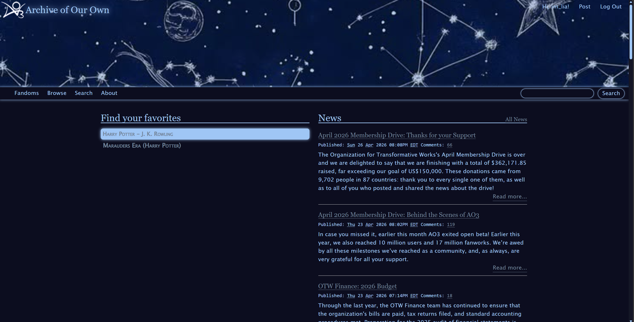
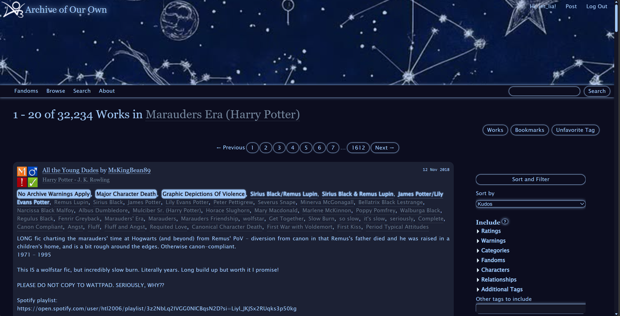
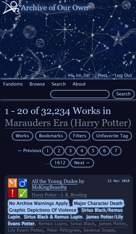
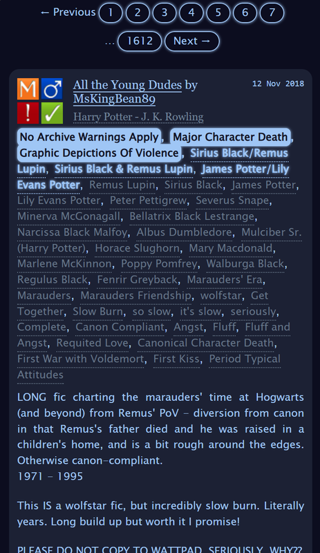
✦ Skin Preview ✦
Click To Expand
✦ How To Use Skins: Instructions ✦
Click To Expand
- Go to your profile dashboard and navigate to the side bar where it says "Skins"
- Click on "Create Site Skin"
- Name it something unique (Like "Starfall - [your username]")
- Copy the ENTIRE code into the textbox where it says "CSS"
- Scroll down to the bottom of the page and click submit
- Scroll down to the very bottom of the page you were redirected to, and click on "Use"
- And you're done!! Enjoy the skin!
✦ CSS Code ✦
Click To Expand
/*===========================
Starfall - AO3 Skin By Lia
- Skin: Starfall
- File: Starfall - AO3 Skin By Lia.css
- Author: Lia
- Tumblr & GitHub: itslia27
- AO3 Profile: im_lia
- Posted: March 9th, 2026
- Updated: April 29th, 2026
- Inspired By: 🌌🌌🌌 (as it appears on apple devices)
"Constellations" by thevalkyrieflies on Tumblr
"Neos" by ZerafinaCSS on AO3
============================*/
:root {
--bg-dark: #0d0e1f;
--bg-deep: #151726;
--bg-card: #1e2235;
--bg-mid: #424c5e;
--accent: #a8c7f7;
--accent-dim: #76859b;
--accent-freeform: #677487;
--glow: 0px 0px 7px #a8c7f7;
--glow-sm: 0px 0px 3px #a8c7f7;
--radius-small: 4px;
--radius-mid: 8px;
--radius-big: 12px;
--radius-btn: 20px;
--radius-tag: 6px;
}
#outer.wrapper {
background: var(--bg-dark);
color: var(--accent);
}
#main a {
color: var(--accent-dim);
}
* {
scrollbar-color: var(--accent) var(--bg-deep);
scrollbar-width: thin;
}
#header {
background-image: url("https://i.pinimg.com/736x/93/5a/33/935a33b7fe78da207ed8fc3ca90fdcc4.jpg");
background-repeat: no-repeat;
background-size: cover;
background-position: center center;
background-color: var(--bg-deep);
}
#header .heading {
height: 15em;
}
#header .primary {
background: var(--bg-dark);
box-shadow: var(--glow);
}
#header .logo,
#header .heading sup {
visibility: visible;
filter: brightness(0) invert(1) sepia(1) saturate(5) hue-rotate(180deg);
}
#header h1,
#header h1 a {
color: var(--accent) !important;
text-shadow: 0 0 10px rgba(168, 199, 247, 0.7);
}
#header h2 {
background: var(--accent) !important;
color: var(--bg-dark);
box-shadow: var(--glow);
}
#header .heading a {
color: var(--bg-deep);
text-shadow: 0px 0px 15px var(--accent);
}
#greeting img.icon {
display: none;
}
span.submit.actions input.button {
display: none;
}
#header .primary .actions a,
#header .primary .actions li a,
#header ul.navigation.actions li a,
#header .actions a,
#greeting a.dropdown-toggle {
background: transparent !important;
border: none !important;
box-shadow: none !important;
color: var(--accent) !important;
}
#greeting .menu,
#header .dropdown .menu,
#header .dropdown:hover a {
background: var(--bg-dark);
box-shadow: var(--glow);
border-radius: var(--radius-mid);
}
#header li.search {
position: relative;
display: flex;
align-items: center;
}
#header li.search::before {
display: none;
}
#header #search .text,
.search [role="tooltip"] {
background: var(--bg-dark);
box-shadow: var(--glow);
color: var(--accent) !important;
border: 1px solid var(--bg-dark);
border-radius: var(--radius-btn);
width: 12em;
padding-left: 0.75em;
}
form.search input[type=text],
form.search input[type=submit],
.autocomplete div.dropdown ul {
background: var(--bg-dark) !important;
border: none;
box-shadow: var(--glow);
color: var(--accent);
display: block;
border-radius: var(--radius-mid);
}
.dropdown {
background: var(--bg-dark);
border-radius: var(--radius-mid);
}
#dashboard.own {
border-top: 5px solid var(--accent);
border-bottom: 5px solid var(--accent);
box-shadow: none;
}
#dashboard a {
color: var(--accent-dim);
transition: color 0.2s;
text-decoration: none;
}
#dashboard ul li a {
border: none !important;
box-shadow: none !important;
border-radius: var(--radius-small);
transition: color 0.2s;
}
#dashboard a:hover,
#dashboard ul li a:hover,
#dashboard ul li a:focus {
background: linear-gradient(135deg, #a8c7f733, #4a7abf55) !important;
border-left: 3px solid var(--accent) !important;
color: var(--accent) !important;
box-shadow: none;
text-decoration: none;
border-radius: var(--radius-small);
}
#dashboard .module h3,
#dashboard h3 {
background: var(--accent) !important;
color: var(--bg-dark) !important;
box-shadow: none !important;
}
.current,
#dashboard .current {
background: var(--accent) !important;
color: var(--bg-dark) !important;
box-shadow: var(--glow) !important;
border-radius: var(--radius-small);
font-weight: bold;
border-left: none !important;
padding-left: 0.75em !important;
}
.actions a,
.actions a:focus,
.actions a:link,
.actions a:visited,
.actions input:focus,
.actions li a,
.actions li input,
.actions li input[type="submit"],
.actions li label,
.action:focus,
.action:link,
.own .actions a,
.own input[type="submit"],
input[type="submit"],
ul.navigation.actions li a,
a.action {
background: transparent !important;
border: 1px solid var(--accent) !important;
color: var(--accent) !important;
box-shadow: var(--glow-sm) !important;
border-radius: var(--radius-btn);
text-decoration: none !important;
}
span.delete {
background: var(--accent);
box-shadow: var(--glow);
border-radius: var(--radius-small);
}
span.delete a {
color: var(--bg-dark) !important;
font-weight: bold;
}
ul.work.navigation.actions button,
ul.work.navigation.actions button.collapsed,
li.chapter button,
li.mark button[type="submit"],
li.download button,
li.bookmark button {
background: transparent !important;
border: 1px solid var(--accent) !important;
color: var(--accent) !important;
box-shadow: var(--glow-sm) !important;
border-radius: var(--radius-btn) !important;
font-size: 1em !important;
padding: 0.25em 0.75em !important;
}
ul#chapter_index.expandable.secondary {
background: var(--bg-dark) !important;
border: 1px solid var(--accent) !important;
box-shadow: var(--glow) !important;
padding: 0.5em !important;
border-radius: var(--radius-mid) !important;
}
ul#chapter_index select {
background: var(--bg-dark) !important;
color: var(--accent) !important;
border: 1px solid var(--accent) !important;
box-shadow: var(--glow-sm) !important;
border-radius: var(--radius-small) !important;
}
ul#chapter_index button {
background: transparent !important;
border: 1px solid var(--accent) !important;
color: var(--accent) !important;
box-shadow: var(--glow-sm) !important;
border-radius: var(--radius-btn) !important;
}
form[action*="mark_as_read"] button[type="submit"] {
background: transparent !important;
border: 1px solid var(--accent) !important;
color: var(--accent) !important;
box-shadow: var(--glow-sm) !important;
border-radius: var(--radius-btn) !important;
font-size: 1em !important;
padding: 0.25em 0.75em !important;
}
form dl,
fieldset,
fieldset fieldset,
fieldset fieldset fieldset,
fieldset fieldset dl dl,
dd.hideme,
form blockquote.userstuff,
input,
select,
select:focus,
textarea,
span.symbol.question {
background: var(--bg-dark) !important;
color: var(--accent) !important;
border: 1px solid var(--accent);
box-shadow: var(--glow);
border-radius: var(--radius-mid);
}
.own {
background: var(--bg-dark) !important;
color: var(--accent) !important;
border: 1px solid var(--accent);
box-shadow: none;
border-radius: var(--radius-mid);
}
label,
label.required,
.autocomplete li.added,
.post .meta dd ul li.added {
color: var(--accent);
}
form.verbose legend,
.verbose form legend {
background: var(--accent);
color: var(--bg-deep) !important;
box-shadow: var(--glow);
border-radius: var(--radius-small);
}
.ui-sortable li,
.dynamic form,
div.dynamic {
background: var(--bg-dark);
border: 1px solid var(--accent);
border-radius: var(--radius-mid);
}
.listbox .index {
background: var(--bg-dark);
}
.listbox,
fieldset fieldset.listbox {
background: var(--accent);
box-shadow: var(--glow);
border-radius: var(--radius-big);
}
form.filters {
position: sticky;
top: 2vh;
max-height: 96vh;
overflow-y: scroll;
border: none !important;
box-shadow: none !important;
}
form.filters:not(:hover) {
scrollbar-color: transparent transparent;
}
.filters fieldset,
.filters .group,
.filters dl,
.filters dd,
.filters dt {
border: none !important;
box-shadow: none !important;
background: transparent !important;
}
.filters .expander {
background: url("https://64.media.tumblr.com/55bf0c446ff42c1e540e284f3053c838/96ac613e2494df28-fa/s75x75_c1/8ca02eec81402fcafe2b9706f27c478e46e50b8b.png") left center no-repeat;
color: var(--accent) !important;
font-weight: bold;
}
.filters .expanded .expander {
background: url("https://64.media.tumblr.com/bc4316019f28c4f7319fdda9fa5ef6e3/b069339f02afb632-6b/s75x75_c1/ed512a784a5845c4981c2bfcb6b711126ba7504e.png") left center no-repeat;
}
#main .filters,
#main .filters fieldset,
#main .filters .group,
#main .filters dl,
#main .filters dd,
#main .filters dt,
#main .filters legend,
#main .filters label,
#main .filters input,
#main .filters select {
background: var(--bg-dark) !important;
color: var(--accent) !important;
border-color: var(--accent) !important;
}
#main #filters,
.filters-head,
.sort-and-filter,
#sort-and-filter {
background: var(--bg-dark) !important;
color: var(--accent) !important;
border: none !important;
box-shadow: none !important;
}
#main .filters select option {
background: var(--bg-dark) !important;
color: var(--accent) !important;
}
#main .filters input[type="text"] {
background: var(--bg-deep) !important;
color: var(--accent) !important;
border: 1px solid var(--accent) !important;
border-radius: var(--radius-small);
}
.warnings .tag,
.work .warning a.tag,
dd.warning.tags a {
background: var(--accent);
border: 1px solid var(--accent);
border-radius: var(--radius-tag);
color: var(--bg-deep) !important;
font-weight: bold;
padding: 0 2px;
box-shadow: var(--glow-sm);
}
.relationships .tag,
.work .relationships a.tag,
dd.relationship.tags a {
background: none;
color: var(--accent) !important;
font-weight: bold;
text-shadow: 0px 0px 3px var(--accent);
}
.freeforms .tag,
.work .freeform a.tag,
dd.freeform.tags a,
dd.character.tags a,
.characters .tag {
color: var(--accent-freeform) !important;
}
.tag:hover,
a.tag:hover {
color: var(--accent) !important;
background: var(--bg-mid) !important;
border-color: var(--accent) !important;
border-radius: var(--radius-tag);
text-decoration: none !important;
}
li.blurb {
background: var(--bg-deep) !important;
border: none;
box-shadow: none;
border-radius: var(--radius-big);
}
li.blurb:hover {
box-shadow: var(--glow) !important;
transition: box-shadow 0.2s ease;
}
li.blurb.group,
li.blurb .group {
background: var(--bg-card) !important;
}
.blurb h4 a,
.blurb h4,
.blurb h3 a,
.blurb h3,
li.blurb h4 a,
li.blurb h4 {
color: var(--accent) !important;
text-decoration: none;
}
h4.heading.byline {
background: var(--accent);
color: var(--bg-deep) !important;
border-radius: var(--radius-small);
}
dl.meta {
border: 1px solid var(--accent);
box-shadow: none;
border-radius: var(--radius-big);
}
dl.stats {
display: flex;
flex-wrap: wrap;
justify-content: right;
column-gap: 0.9em;
}
dl.stats dt {
display: none !important;
}
dl.stats dd {
display: flex;
align-items: center;
position: relative;
font-size: inherit;
}
dl.stats dd::before {
display: inline-block;
width: 1em;
height: 1em;
margin-right: 0.4em;
background-position: center;
background-size: contain;
background-repeat: no-repeat;
content: "";
transform: translate(0, 1px);
filter: brightness(0) saturate(100%) invert(79%) sepia(28%) saturate(500%) hue-rotate(185deg) brightness(105%) contrast(95%) opacity(85%);
}
dl.stats dd::after {
display: none;
position: absolute;
top: 1.6em;
left: 50%;
transform: translateX(-50%);
z-index: 99999;
padding: 0.3em 0.5em;
border: 1px solid var(--accent);
border-radius: var(--radius-small);
box-shadow: var(--glow-sm);
background: var(--bg-dark);
color: var(--accent);
font-size: 0.75em;
line-height: 1;
white-space: nowrap;
}
dl.stats dd:hover::after {
display: inline-block;
}
dl.stats dd.language::before {
background-image: url("https://zerafinacss.github.io/ao3/stats-icons/language-01.png");
}
dl.stats dd.language::after {
content: "Language";
}
dl.stats dd.words::before {
background-image: url("https://zerafinacss.github.io/ao3/stats-icons/words-01.png");
}
dl.stats dd.words::after {
content: "Words";
}
dl.stats dd.chapters::before {
background-image: url("https://zerafinacss.github.io/ao3/stats-icons/chapters-01.png");
}
dl.stats dd.chapters::after {
content: "Chapters";
}
dl.stats dd.collections::before {
background-image: url("https://zerafinacss.github.io/ao3/stats-icons/collection-01.png");
}
dl.stats dd.collections::after {
content: "Collections";
}
dl.stats dd.comments::before {
background-image: url("https://zerafinacss.github.io/ao3/stats-icons/comments-01.png");
}
dl.stats dd.comments::after {
content: "Comments";
}
dl.stats dd.kudos::before {
background-image: url("https://zerafinacss.github.io/ao3/stats-icons/kudos-01.png");
}
dl.stats dd.kudos::after {
content: "Kudos";
}
dl.stats dd.bookmarks::before {
background-image: url("https://zerafinacss.github.io/ao3/stats-icons/bookmarks-01.png");
}
dl.stats dd.bookmarks::after {
content: "Bookmarks";
}
dl.stats dd.hits::before {
background-image: url("https://zerafinacss.github.io/ao3/stats-icons/hits-01.png");
}
dl.stats dd.hits::after {
content: "Hits";
}
dl.stats dd.published::before {
background-image: url("https://zerafinacss.github.io/ao3/stats-icons/published-01.png");
}
dl.stats dd.published::after {
content: "Published";
}
dl.stats dd.status::before {
background-image: url("https://zerafinacss.github.io/ao3/stats-icons/updated-01.png");
}
dl.stats dd.status::after {
content: "Updated";
}
li.comment {
border: 1px solid var(--accent);
border-radius: var(--radius-big);
}
.comment div.icon {
border-bottom: 5px solid var(--accent);
box-shadow: var(--glow);
border-radius: var(--radius-mid);
}
.thread .even {
background: var(--bg-mid);
}
.unread {
background: var(--bg-dark);
border: 5px dashed var(--accent) !important;
}
span.unread {
background: var(--accent);
color: var(--bg-deep) !important;
border-radius: var(--radius-small);
}
span.replied {
background: var(--bg-dark);
color: var(--accent);
border: 2px solid var(--accent);
box-shadow: var(--glow);
border-radius: var(--radius-small);
}
span.indicator::before {
box-shadow: var(--glow);
}
.notice,
.comment_notice,
.kudos_notice,
ul.notes,
.caution,
.error,
.comment_error,
.kudos_error,
.alert.flash {
background: var(--accent);
box-shadow: var(--glow) !important;
color: var(--bg-dark);
border: none;
border-radius: var(--radius-mid);
}
.notice a,
.comment_notice a,
.kudos_notice a,
ul.notes a,
.caution a,
.error a,
.comment_error a,
.kudos_error a,
.alert.flash a {
color: var(--bg-mid) !important;
font-weight: bold;
}
.splash .module h3 {
color: var(--accent);
border-bottom: 2px solid var(--accent);
}
.splash .favorite li:nth-of-type(2n+1) a {
background: var(--accent);
box-shadow: var(--glow);
color: var(--bg-dark) !important;
font-weight: bold;
font-variant: small-caps;
border-radius: var(--radius-tag);
}
.splash .favorite li:nth-of-type(2n+2) a {
color: var(--accent);
font-weight: bold;
font-variant: small-caps;
font-size: 110%;
}
.splash .favorite li:nth-of-type(2n+1) a:hover,
.splash .favorite li:nth-of-type(2n+2) a:hover {
background: var(--bg-mid);
color: var(--accent);
font-weight: bold;
font-variant: small-caps;
border-radius: var(--radius-tag);
}
#stat_chart svg rect:first-of-type {
opacity: 60%;
}
#stat_chart g[clip-path^=url] > g:nth-of-type(2) rect,
#stat_chart svg g:nth-of-type(2) > g rect:last-of-type,
#stat_chart g[clip-path^=url] > g:nth-of-type(2) rect:first-of-type {
filter: hue-rotate(140deg);
opacity: 80% !important;
}
.statistics .index li:nth-of-type(2n) {
background: var(--bg-dark);
border: 1px solid var(--accent);
border-radius: var(--radius-small);
}
.reading h4.viewed,
dl.index dd,
table,
th,
dt.child {
background: var(--bg-dark);
}
.draft {
background: var(--bg-dark);
color: var(--accent);
border: 2px dashed var(--accent);
box-shadow: var(--glow);
border-radius: var(--radius-big);
}
.draft .wrapper {
background: var(--bg-dark);
border: 1px solid var(--accent);
border-radius: var(--radius-mid);
}
.event .userstuff {
background: var(--accent);
border: 1px solid var(--accent);
border-radius: var(--radius-mid);
}
#footer {
background: var(--bg-mid);
color: var(--accent);
border-top: 3px solid var(--accent);
box-shadow: var(--glow);
}
#footer a,
#footer .heading,
#footer .heading a {
background: transparent !important;
border: none !important;
box-shadow: none !important;
color: var(--accent) !important;
border-radius: 0 !important;
}
#modal {
background: var(--bg-dark);
color: var(--accent);
border: 2px solid var(--accent);
box-shadow: var(--glow);
border-radius: var(--radius-big);
}
✦ Changelog ✦
April 28th, 2026
- Rounded corners
- Added a fill to fics for improved readability
April 29th, 2026
- Added "Date Posted" & "Date Updated" Icons
- Added hover glow effect to fics/blurbs
April 30th, 2026
- Fixed dashboard mobile appearance